Saudi Bus Rentals, a quote-first website for coach hire
A coach and minibus hire website for Saudi Arabia, designed so a group organiser can send journey details before they've scrolled past the first screen.
What the site had to do
Saudi Bus Rentals hires out coaches and minibuses across Saudi Arabia. People booking a coach are nearly always organising transport for someone else: a family flying in, a company moving staff, a group heading to Mecca or Medina. They want a price. Quickly.
So the website's job wasn't to explain bus hire at length. It was to collect journey details from someone on a phone, with as little effort on their side as possible, and get them to a person who can quote.
A two-step quote form in the hero
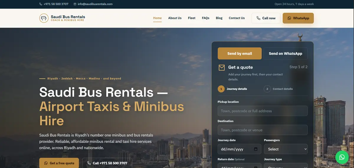
The quote form sits on the right of the first screen, beside the headline, so nobody has to hunt for it. It's split into two steps. Step one asks about the trip: pickup, destination, date, number of passengers, an optional return date and the journey type. Step two asks for contact details.
Journey first was a deliberate choice. People planning a trip are happy to type where they're going. Ask for a phone number before that and some of them close the tab.
Above the form are two tabs, Send by email and Send on WhatsApp. Plenty of customers in the Gulf would rather send a WhatsApp message than wait for an email reply, so the form lets them pick.
On the left, a short line above the headline names the cities people search for (Riyadh, Jeddah, Mecca, Medina) and the headline itself says what's on offer in plain words.
Made for enquiries on a phone
A thin top bar carries the phone number, the email address and the opening hours, which for this business are 24 hours a day, 7 days a week. Under it, the header keeps a Call now button and a gold WhatsApp button next to the menu.
There's also a green WhatsApp button fixed to the bottom corner of the screen. And under the hero text sit two more buttons, one for a free quote and one that dials the number directly. On a phone, someone is never more than a tap away from talking to the company.
The date fields use the phone's own date picker, so nobody has to guess a date format.
One honest note. Splitting a form into steps makes it feel shorter, but every extra screen is a place where people can drop off. If step two loses people, the fix is usually fewer contact fields, not more design.
Want a site that works like this for your business? Call or WhatsApp us on +971 52 292 3875.
Ready to get started?
Free consultation. We reply the same working day.